
If you have been following my work this past year, you may have noticed that I have not used many cotton prints. Which, quite frankly is a shame because 40s prints were colorful, vibrant, and artistic. In my work so far, I have made use of wools, sheer cottons, cotton seer suckers, or else simple cotton checks, flocked dots or plaids. Beyond that, I seemed to have omitted the very foundations of 40s fashion: colorful prints done up in the most versatile of fabrics, plain weave cottons. Were they completely omitted? No, I have used some in my past projects already.


Why have I done this? I believe I have done this in an attempt to get away from using a material that in the past I always used for my projects. Feeling like I was lacking versatility and flexibility in my sewing skills, I tried to use new materials. Through these new materials, such as rayon crepe, fine wools, and even silk, I definitely learned a few things and am certainly a better seamstress for it.

As of late though, I have found myself desiring to return to my roots and as a result want to get back to sewing with plain weave cottons. To facilitate my return, I want to look at what were period 40s prints, what kinds of motifs, sizes, and colors were used? These are only some of the questions that I want to explore to aid me in my search of period 40s cottons. I hope too that my research here will aid others as well.


COLOR
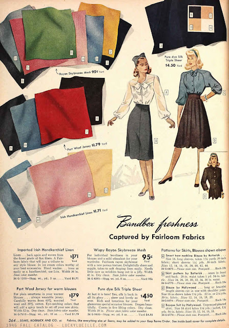
The colors used in the 40s ranged from vibrantly bright jewel tones to those dusty romantic ones. Look for navy blues and blues of all kinds along with yellows, pinks, reds, tans, browns, aqua, oranges, greens, purples, burgundies, creams and white. Of all the colors, many have a juvenile air to them but there are also just as many that are more mature (if a touch less common). These colors were seen in solid rayon, broad cloth, and other materials and weaves, including cottons.

PRINTS
When I started to look at 40s prints, I was truly impressed with the immense variety that was available. Of the most popular prints, I noticed stripes and florals (flowers, leaves, and organic subject matter) were the most common, next were plaids, checks, dots, paisleys, and novelty prints. The florals ranged from small to medium in size. There were some large florals but were rather rare and had small/ medium flowers mixed in with the print. The flowers, leaves, and other organic figures ranged from abstract cartoon like images to almost realistic impressions. This blend of abstract and realistic offers a true blend of personality to 40s prints. Almost any individuals taste could be serviced in this decade it would appear. Of these florals, florals mixed with stripes or plaids, florals mixed with dots, and florals mixed with florals seemed to be very popular. Nature seemed to provide a great deal of inspiration.

 |
| Although a 30s ad, there are some elements here that resonate into the 40s. |


Plaids and checks were popular as well and came in a large variety of color ways, sizes, and complexities. Some plaids were simple and some were very complicated. Dots largely made use of two colors, one color for the background and the other for the dots. I have not seen dots that were multicolored. Novelty prints were based on abstract designs and cartoons. Although they drew inspiration from the real world, these novelty prints offered a sort of escape. Some novelty prints included small animals, sailors, and other patriotic themes. The scale of these prints was rather small and they seemed to be a very American item. Something to consider when building a wardrobe for specific impression. Boarder prints were also seen.


Of the prints, I have noticed that some have distinct patterns and directions while some are more “random”. These prints that seem to lack any true directions must have been especially practical to frugal or beginning seamstresses because the prints did not have to line up in any particular way. For the prints that had a direction but were small in scale, those too did not necessarily have to line up in the event there was simply not enough material. These small prints were very common due to that rationing that the war brought on.


No matter an American, British, French, German, or another impression all together, 40s prints seemed to not have changed too much from country to country. As a whole, the prints and colors seen in the 40s appears to be a larger world trend. In the pages of Der Goldene Schnitt, The illustrations give hints and suggestions of prints and fabric choices in the brief descriptions. Stripes seemed to be incredibly popular based on Der Goldene Schnitt’s recommendations. Next were florals and solids.